Friday, 22 March 2013
Final finished piece.

This is my finished front cover. I have still used the skyline, main image, triangular sell line and cover mount as I'd planned. However, the layout has changed a bit from my original idea. The cover mount is on the right of the magazine instead of the left, which is unusual but I tried it on the left and it looked wrong as the legs of the models couldn't be seen. I have also created a vertical masthead as opposed to a horizontal one. I believe that this will make the magazine stand out and if magazines are stacked on top of each other in a news agent's, the left side will be all that is visible. In this case, my magazine would prove easy to locate. I have used a colour scheme of blues, white, green and red. This is also carried on inside the magazine which I like. Also the font I have used is 'Gill Sans Ultra Bold' which I chose because it stands out and is easy to read. I also used green arrows to separate the sell lines. I really like this feature as it looks quite effective and points to the main image. I decided to use a photoshopped image for the cover mount only. This will be beneath the free album, and shows what the album cover would look like. I chose to photoshop it because real music album covers are photoshopped, and it makes it stand out as it is very bright. I haven't used photoshop on any other images because I found in the samples I tried that it didn't look very effective and changed the look of my simple magazine to something much more complicated and untruthful.

This is my finished contents page. The colour scheme and font are the same as the front cover which shows continuity. I like that. In my plan I used arrows to house the text, however I decided against this method for the real thing as it didn't leave much room for images and although it is original in its design, it is not the norm for a music magazine and I thought it looked a bit out of place. I used three of my images at the bottom of the page to show the main subject of the issue. In hindsight, it would have been good to take pictures of other articles relevant to the magazine to show what else would be inside it. If I were to make this magazine again then this is what I would do.

This is my final double page spread. I have carried on the font and red and white colours of the previous pages. However I decided to add black in this page and I think that the result is very effective. I have used two quotes in the text as I wanted to in my plan. They are bigger than the rest of the text and stand out to draw in the reader's attention. I decided to write in white for the questions, although to make it clear which band member said which answer I wrote them in blue and lilac, stereotypical boy/girl colours. I like this idea because it is very easy to pick out what each person said and means questions can be picked out and read one at a time if the reader wishes. I used nine images on this page even though it was only necessary to use four throughout my magazine. I really liked the images I took and I didn't want the page to be mostly text as this would appear dull. The images on the left page look more professional, but for the right side I wanted to use images which look far less formal to stick to my simplistic and realistic design. These show the band members in a real life situation which is not often done in magazines and proves mine to be exclusive.
I really like the magazine I have created and I think it turned out very well and professional-looking.
Friday, 1 March 2013
Interview with the band.
This is the interview with my band for the double page spread of my magazine.
Dream Kids.
Dream Kids.
1) What inspires your music?
You know, life experiences.
Various other artists inspire me to create my music.
2)Do you have a big fanbase?
Yeah, it's pretty big.
3)You're quite big in Britain, would you like to take your music to America?
Yes! By far!
Yeah, I think it would be really cool to play over there.
4)How did you two meet?
At college in Wales.
He actually lent me a pen on the first day which was pretty nice.
5)So who writes the songs out of you two?
Well I'm the creative one so mainly me, but we work together on some.
6)Who has the worst habits on the tour bus?
Paige does, she sucks her thumb!
He's always playing pranks on me, like hiding my stuff when we're about to go on stage!
7)How long have you wanted to be a musician?
Forever and always, since I got my first CD! (Atomic Kitten)
Since I could talk all I wanted to do was sing.
8)What's your favourite thing to do in your time out?
Eat Ben n Jerry's ice cream!
Um...I really like going swimming, it's my hobby. When I get time that is!
9)Is your life stressful and busy?
Yeah, but I cope with it 'cos I've got Paige to keep me company.
Aaaww!
10)Are you two in a relationship?
No, she's like my sister.
Both of us are single but we like it.
11)Would you ever consider adding more members to your band?
No. We don't need anyone else.
Maybe if we had the opportunity, but I think we work pretty well as we are.
12)Where would you most like to play around the world?
I think Australia would be a groovy place to go.
I'd really like to tour Japan.
I'd really like to tour Japan.
13)Do you ever get lonely on tour?
We get fanmail and stuff and I'm on the phone a lot to my friends back home in Wales.
Not really because we have all the technicians to chat to and we're busy organising the shows a lot with them. There's not really time to be lonely.
Not really because we have all the technicians to chat to and we're busy organising the shows a lot with them. There's not really time to be lonely.
14)Do you ever argue?
All the time.
All the time.
She just attacks me over silly stuff.
No I don't!
No I don't!
See?
15)Who would you love to collaborate with?
Ed Sheeran definitely.
The In Crowd.
The In Crowd.
Wednesday, 30 January 2013
Inspiration for my front cover.


These are the inspirations for what I want the members of my (made up) cover band to look like. I am using two girls and a boy. I would like their outfits to look like Olly Murs, Rita Ora and Hayley Williams. I chose these musicians as they have style and the models I'm using sort of look like them already. In a few of my photos I would like one of the models to maybe hold a guitar or something relevant to the music that they'd make. Maybe they called also hold up signs with their song lyrics or new album titles written on. I think that would look good. Especially in black and white.
Saturday, 12 January 2013
Plan for music magazine front cover (images and fonts).
Lots of magazines have cover mounts. These are the spaces on the front cover, usually at the bottom, where a free gift is stuck. Music magazines may give away simple copies of new albums from featured bands, which is what I want to do on my front cover.
To imply where the album would be mounted, I intend to put an image of the free album. This way, when the album would be removed from the cover there would be no empty spaces, just the same photo.
Here are some examples of album covers which could inspire my cover mount image:
 This is a Lily Allen album cover. It contains a lot of artwork which would have been added in using ICT. It could potentially be a long and laborious process.
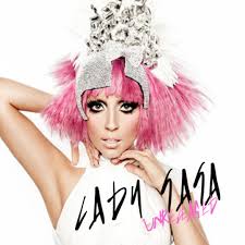
This Lady GaGa album cover is fairly basic; a white background, a main image and the album and artist names. It could be easy to do once the artist has been dressed up. However this image is quite close up, which would be difficult to do with the four members of my band.
Some album cover are simple drawings which could be a good idea if the artist is skilled.

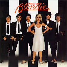
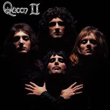
Here are some cover albums with more than one artist on, which would better suit my band.

 I like this font because it looks quite simple but it is effective, however it is not very eye-catching or exciting.
 I like the bold colours used in this font, however the design itself could be a bit difficult to read.
 I really like bold fonts as the stand out well and I would like to use them in my final piece. However, I would make them colourful so they stand out.
To imply where the album would be mounted, I intend to put an image of the free album. This way, when the album would be removed from the cover there would be no empty spaces, just the same photo.
Here are some examples of album covers which could inspire my cover mount image:
This Lady GaGa album cover is fairly basic; a white background, a main image and the album and artist names. It could be easy to do once the artist has been dressed up. However this image is quite close up, which would be difficult to do with the four members of my band.
Some album cover are simple drawings which could be a good idea if the artist is skilled.
Here are some cover albums with more than one artist on, which would better suit my band.
Font.
Magazine fonts can help to express the genre of a magazine, so here are some fonts which I could use on my front cover to represent the musical theme.
I like this font because it looks quite simple but it is effective, however it is not very eye-catching or exciting. I like the bold colours used in this font, however the design itself could be a bit difficult to read.Thursday, 10 January 2013


Wednesday, 9 January 2013
Photos for Music Magazine.

I like the first of these two images because it is the better one so I wouldn't use the one below.


This image is a possibility for the man image on the front cover.
I won't be using the one below. It's not one of the best.

I won't use the image below.


These two I like, I think they worked well and they are definite possibilities for the main image on the front cover.


I also really like the above image and the below two images.


I won't be using these images of the waistcoat as they didn't really work well. I was trying to take natural photos as the models were moving around so they didn't look so posed, but these didn't work at all I don't think.


I like the above image and it is a possibility to use it.


I like these two images.


These two are nice but I won't use them as I have taken better ones.


I like these images with the signs and I will use one to go on the cover mount space to show where the free album copy would go. If the album were real the image I use would also be on the cover of the case.


I wanted to take some photos that didn't look so staged, so I took a few long shots to show the studio and I quite like the way they turned out.


I like these photos a lot and I think that the signs worked really well.


I wanted some less serious photos to show that the band were fun.


Some images like the one below did not come out well. If I were to take them again then I would need to check that the camera was in focus first.


Subscribe to:
Posts (Atom)