Wednesday, 30 January 2013

Inspiration for my front cover.


These are the inspirations for what I want the members of my (made up) cover band to look like. I am using two girls and a boy. I would like their outfits to look like Olly Murs, Rita Ora and Hayley Williams. I chose these musicians as they have style and the models I'm using sort of look like them already. In a few of my photos I would like one of the models to maybe hold a guitar or something relevant to the music that they'd make. Maybe they called also hold up signs with their song lyrics or new album titles written on. I think that would look good. Especially in black and white.

Saturday, 12 January 2013

Plan for music magazine front cover (images and fonts).

Lots of magazines have cover mounts. These are the spaces on the front cover, usually at the bottom, where a free gift is stuck. Music magazines may give away simple copies of new albums from featured bands, which is what I want to do on my front cover.

To imply where the album would be mounted, I intend to put an image of the free album. This way, when the album would be removed from the cover there would be no empty spaces, just the same photo.

Here are some examples of album covers which could inspire my cover mount image:
 This is a Lily Allen album cover. It contains a lot of artwork which would have been added in using ICT. It could potentially be a long and laborious process.

This Lady GaGa album cover is fairly basic; a white background, a main image and the album and artist names. It could be easy to do once the artist has been dressed up. However this image is quite close up, which would be difficult to do with the four members of my band.


Some album cover are simple drawings which could be a good idea if the artist is skilled.


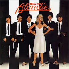
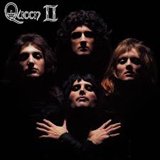
Here are some cover albums with more than one artist on, which would better suit my band.


Font.
Magazine fonts can help to express the genre of a magazine, so here are some fonts which I could use on my front cover to represent the musical theme.
I like this font because it looks quite simple but it is effective, however it is not very eye-catching or exciting.
 I like the bold colours used in this font, however the design itself could be a bit difficult to read.

I really like bold fonts as the stand out well and I would like to use them in my final piece. However, I would make them colourful so they stand out.

Thursday, 10 January 2013

Wednesday, 9 January 2013

Photos for Music Magazine.

I like the first of these two images because it is the better one so I wouldn't use the one below.

 This image is a possibility for the man image on the front cover.
 I won't be using the one below. It's not one of the best. 
 I won't use the image below.

 These two I like, I think they worked well and they are definite possibilities for the main image on the front cover.
 I also really like the above image and the below two images.


 I won't be using these images of the waistcoat as they didn't really work well. I was trying to take natural photos as the models were moving around so they didn't look so posed, but these didn't work at all I don't think.


 I like the above image and it is a possibility to use it.


 I like these two images.

 These two are nice but I won't use them as I have taken better ones.

 I like these images with the signs and I will use one to go on the cover mount space to show where the free album copy would go. If the album were real the image I use would also be on the cover of the case.


 I wanted to take some photos that didn't look so staged, so I took a few long shots to show the studio and I quite like the way they turned out.

 I like these photos a lot and I think that the signs worked really well.


 I wanted some less serious photos to show that the band were fun.

 Some images like the one below did not come out well. If I were to take them again then I would need to check that the camera was in focus first.