
Wednesday, 24 October 2012


Wednesday, 17 October 2012
Passion magazine contents page.

I chose to do my contents page completely black and white for a bigger impact on the reader. I wrote in bold Garamond in white again to match the cover I made. Also white is readable on a grey background.
I found a stylish main picture and then I wrote around it. All of the featured from the cover are on this page, then I made up some other stories you could find in this sort of magazine such as Paris fashion week and this winter's fashion trends. I also put in offers as some magazines have and a letter from the editor-me.
I wanted to make this page look stylish, fashionable and realistic and I really like what I have done.
The pictures at the bottom link with the stories, Victoria Beckham, Paris fashion week, Fearne Cotton and Chanel fashion in sweaters. I decided on this layout because I wanted to write around a main image as lots of fashion magazines have, but some have lots of pictures, so I added the ones at the bottom. They are small so you can still see the main image.
If I did it again I would maybe add in a page number in the bottom corner or try to make the writing stand out more. Also I could add in more content, but I didn't want the page to be too crowded.
Passion magazine front cover.

I created this front cover for a high-end fashion magazine I have named 'Passion' as in 'Passion for Fashion'. I researched different fashion magazines and what fonts were most popular. In the end I went for Garamond in bold.
I chose to write in white because the background picture of Victoria Beckham is quite dark and white stands out. I also used purple and brown because of the different background colours. I don't think that the purple worked very well because it is quite difficult to read. The brown writing for the price stands out less which is what I wanted. People should be attracted by the cover itself and contents, not the price.
I got a lot of inspiration from 'Vogue' magazine. This is why I decided to use one staple image for my cover. The anchorage title says, 'Sometimes I'm so busy, I forget to take a break.' It was supposed to be a quote I created from Victoria Beckham.
Also I have added a bar code, date and issue number to make my cover look more realistic and professional. I chose a separate font for the masthead because that's usually how magazines look. Also the masthead is a sort of logo and would be what people remember, so a certain font could remind them of my magazine when they see it or are trying to find it.
I put in a couple of sell lines and the buzz word 'NEW' to attract customers.
I am quite pleased with my finished product. There are a few small changes I would make if I were to do it again, however overall I am happy with the way it looks.
Wednesday, 10 October 2012
Examples of college magazines.
These front covers talk a lot about what is going on in the colleges they are from eg. pregnant teens, bright futures and science courses.
I have noticed that the contents pages are all brightly coloured to be bold and eye-catching.
Thursday, 4 October 2012
The break down of Food.
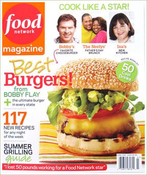 The masthead of this magazine is 'Food network magazine' which is also the logo, positioned at the top left of the page to be easily seen in a news agents.
 There is no cover mount for a free gift and no skyline.
The main image is of a burger and the Anchorage line reads, 'Best Burgers!' to attract the reader. There are also a few sell lines which include, '117 new recipes for any night of the week' and, 'summer grilling guide'.
This cover includes a bar code at in bottom right and an advert for a, '50 cool drinks recipe booklet' inside to attract the reader.
The target audience is food lovers or cooks and I would say it is aimed at both men and women. However the sell line for, 'I lost 50 pounds working for a Food Network star' would suggest that it is more aimed at women because stereotypically they are more likely to want to lose weight or diet.
The break down of Heat.
 Heat magazine is a famous celebrity gossip magazine who's target audience I would assume is young women because of the gossip and free Big Brother magazine.
 What is most interesting about the front cover of Heat is that it appears to have no particular layout system. It looks almost as though the images and words on the page have just been thrown together randomly. This makes it seem more informal.
This front cover shows the date it was published, '6-12 June 2009' and the price '£1.65'. There is also a website you can go to hidden alongside the 'h' in Heat. There is a bar code at the bottom too.
The masthead is simply 'heat' but the title itself acts as a logo as well. There is no cover mount for a free gift however there is an advert for the supplement 'mini mag' for Big Brother inside to attract the reader but there is no skyline.
This cover also appears to have no 'main' image. There are 6 smaller images which add to the random layout of the page. 2 of the images appear to have anchorage title, 'Finally...Robert strips!' and 'young & curvy vs older & skinny'.
Graphic features include the red and pink backgrounds underneath the anchorage titles and the abbreviation 'vs' on top of the images.
The break down of Q.
 Q is a famous music magazine and the red and white logo is well known. It is positioned very cleverly in the top left hand corner of the magazine because in a news agent's the way the magazines are stacked would mean the left hand side or the top is usually all you can see. This makes the magazine easy for the customer to find.
 This issue can be found by the date printed above the bar code which says 'March 2012'. It is obviously a monthly magazine. The price is also above the bar code and I believe it says '£3.99'.
The main image is also the background of the cover and is a picture of Florence from Florence and the Machine. The anchorage title reads, 'Florence woman on the edge' and the puff above it is a quote from Florence saying, 'I feel so alone'.
This magazine cover has no skyline but it has a lot of sell lines which include, 'Meet the new Simon Cowell...(and this one's not a bastard)' and 'Skrillex dance genius or noisy git?' which is also a rhetorical question to entice the reader.
There is also a 'ne column' stamp printed on the front as a sell line to inform the reader of new developments in the magazine. However there are no supplements or cover mount for a free gift.
On the left, hidden in a sell line is the exaggerated buzz word, 'GIG' which is there to attract the reader's attention.
I think that the target audience is definitely music lovers, this issue is probably going to be more attractive to women because of the feature on Florence.
Wednesday, 3 October 2012
The break down of Fabulous.
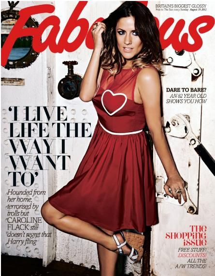 This issue of Fabulous is defined by it's date in the top right hand corner of the page, 'Sunday August 19, 2012'. There is no issue number or bar code on the front page. There is also no price because Fabulous is a supplement, which means that it comes in The Sun newspaper free every Sunday.
 The masthead is bright, big and bold across the top so it is easy to identify in a news agent's however there is no logo. There is also no cover mount (free gift to attract the customer) which could be because the magazine itself is free.
There is no sky line above the masthead but there is an attractive main image. This image relates to the stories inside and also the anchorage title, 'I live life the way I want to'.
On the front cover there are lots of sell lines to entice the reader and get them hooked such as, 'Dare to Bare? An 82 year old shows you how'.
I think that Fabulous magazine has a target audience based on gender-it's aimed at women. I think this because the sell lines indicating the stories inside are about shopping, celebrity gossip and looking good naked. These are all things which stereotypically women would be more interested in.
However I believe that Fabulous could be aimed more at mothers based on the adverts for 'back to school' at M&S and Tesco inside.
Other adverts in the magazine are for: hair cream, accessories, clothes, phones, make up, Boots pharmacy, toilet roll, H.Samuel, Tesco mum of the year award and Cif cleaner.
A lot of these adverts are from big name brands which are well known such as Tesco, M&S, H.Samuel, Boots and Cif. I think because Fabulous is free in the newspaper every Sunday, only the bigger brands can afford the publicity. Also the adverts cater for a lot of needs, even people who just flick through the magazine and look at the pictures.
Subscribe to:
Posts (Atom)